tangle
+
my role
ux design
visual design
brand design
dev support
visual design
brand design
dev support
the project
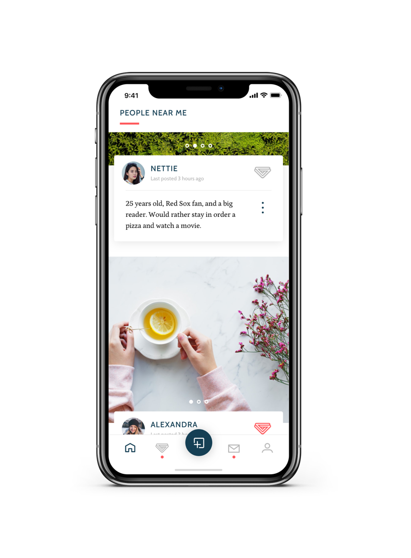
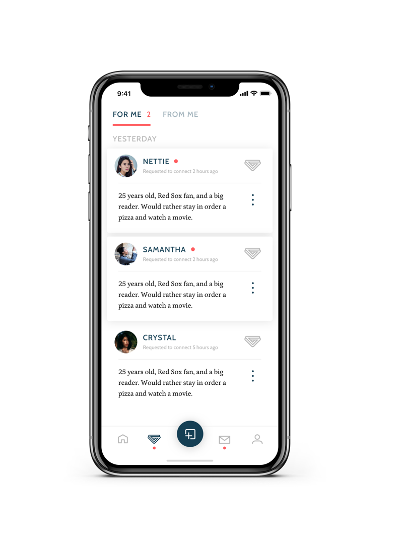
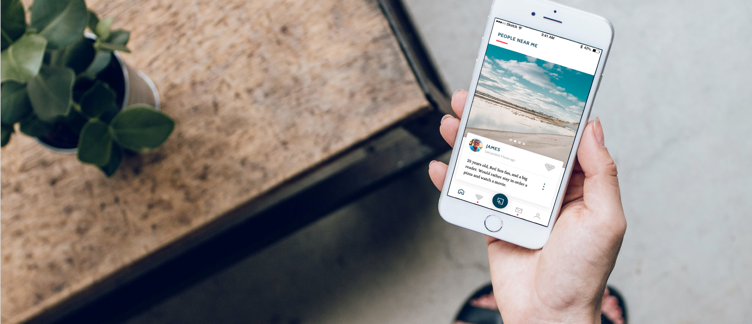
Tangle is a dating app that aims to address issues presented by other dating apps, the primary of these seeing inactive accounts in your feed. Tangle accomplishes this by centering your feed around active content, posted by users, rather than the user profiles themselves; think Instagram meets Tinder. This way, if a user isn’t posting content, they aren’t featured in feeds.
The other effect of centering the experience around user content, is it gives users a more well-rounded picture of the people they are choosing to connect with. Rather than a small set of selfies, a user can showcase their interests and personality more organically over time, as one does in a content app like Instagram.
The other effect of centering the experience around user content, is it gives users a more well-rounded picture of the people they are choosing to connect with. Rather than a small set of selfies, a user can showcase their interests and personality more organically over time, as one does in a content app like Instagram.
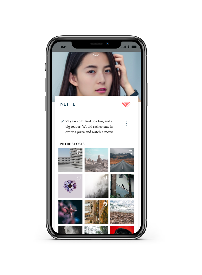
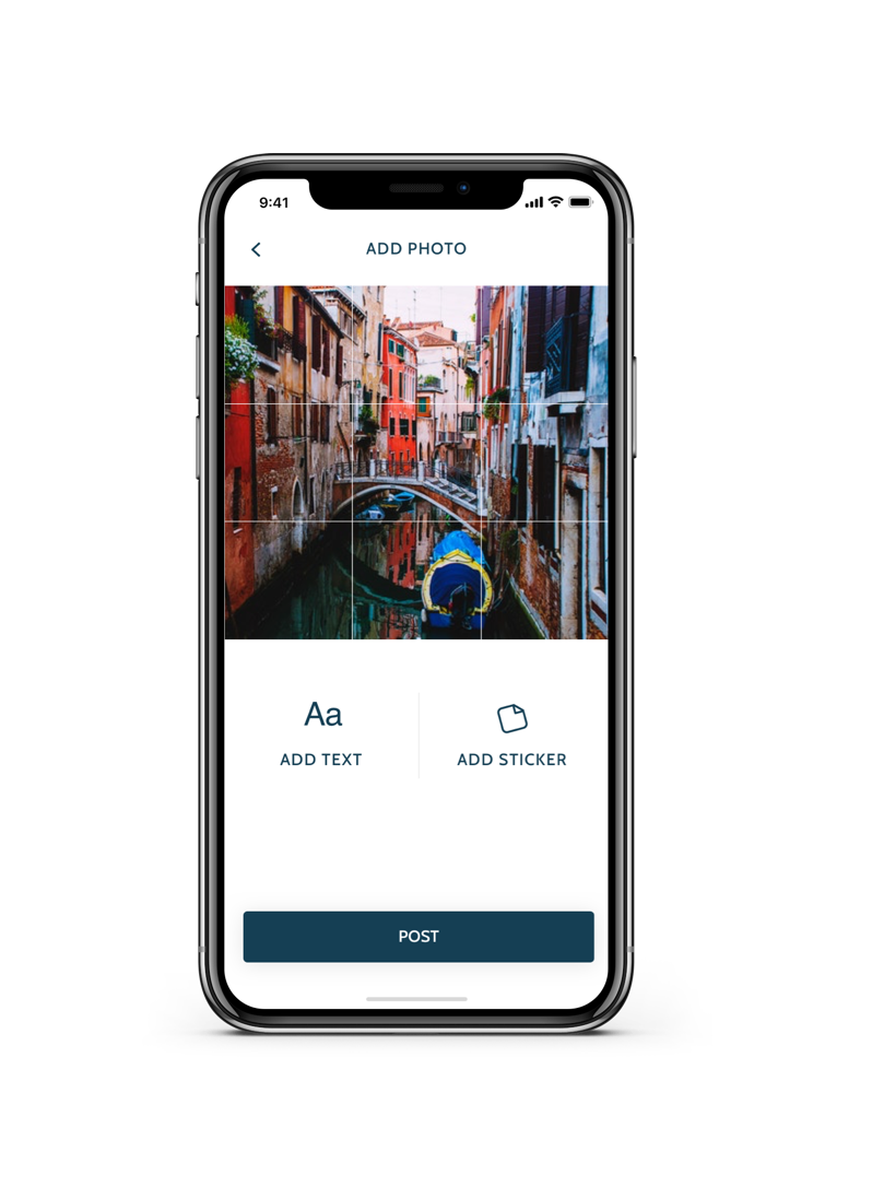
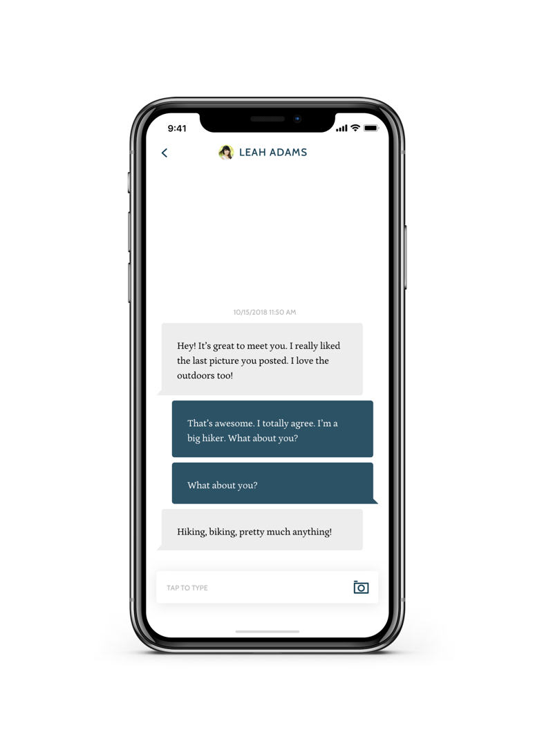
I worked closely with the app creators and developers to design this app, breaking it into a few primary experiences: the home screen feed, your “likes” lists (both incoming and outgoing), your messages and profile.The goal was the make the designs intuitive and streamlines, while making the app feel sophisticated, and pared down, showcasing the users’ content. This should feel like a serious dating platform, not a hook up app.